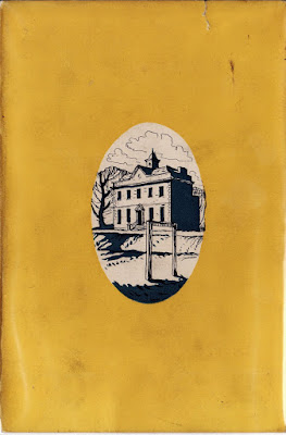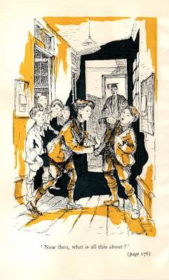
Similar to the first edition of Meredith and Co.—and unlike Mills sequels, King Willow and Minor and Major—Oxford University Press issued Meredith in 1950 without many interior illustrations. In fact, save the frontispiece, all of the remaining illustrations are found on the dust cover. [Click on any image to enlarge it.]
 The jacket and frontispiece are not full colour: It uses a two colour separation (blue and yellow) with black line. The artist isn't renowned. In fact, he is a mid-20th century illustrator in search of a Christian name: P. White.
His wiry and energetic inks, when used to limn people, are somewhat reminiscent of George Cruikshank, making the frontispiece a little gem of a drawing. Unfortunately, it is muddled by the blue and yellow inks of the separation process, which did little for any of the illustrations, interior of exterior.

It is debatable as to whether or not the quality of the illustrator has fallen off from 1939 to 1950, mostly because the work of White here is not shown off in the best light. Certainly, though, we can see that the quality of the overall artistic book and jacket design has fallen off dramatically. Visually, this edition is miles below the level of artwork OUP set when the noted publisher commissioned C. E. Brock to illustrate the first edition of Meredtith.


![Meredith and Co. [1933] by George Mills](https://blogger.googleusercontent.com/img/b/R29vZ2xl/AVvXsEjlUeRNPnH8Xd8JT59QdtabQHRI6DI6Hqew57i6qixjOL3LjgUD9g22o3-wNlmBya36D5-6KZXX-sxLnktAfEqjlvTmdwyiIL2K6VHOGW2Wq9Pe8_oFGknENfVE1Xrkdj0b8FYXTz_6SMg/s1600-r/sm_meredith_1933.JPG)
![King Willow [1938] by George Mills](https://blogger.googleusercontent.com/img/b/R29vZ2xl/AVvXsEgiz_iaQjinIbVw6yQ-W4hwx6wGJwMQH9azCs3Qacp9eX627B7Eq9hMn1wlHLzlkbcflHRWM8VcPX-1uteKbs4LA5q5Oq69WhrnhzBQLjpseK_M34PSoOOhTZ96EfVAGFehG53gZ0M4EvU/s1600-r/sm_1938.JPG)
![Minor and Major [1939] by George Mills](https://blogger.googleusercontent.com/img/b/R29vZ2xl/AVvXsEgH5nj4Q6BNpzVEb1vyJeGV6ikuN4SFAyDa-jypIgbvdrxqcjHkNxqjrXH7ptZmge7oTTpn5QjAI0yCJPdI-fIzooCDD1TAA3RDxO9jzLcU3QOIhBWKiKNz6CPjCSTZgIPd9_4zM7LLpAw/s1600-r/sm_1939.JPG)
![Meredith and Co. [1950] by George Mills](https://blogger.googleusercontent.com/img/b/R29vZ2xl/AVvXsEgm_JPAXPpX0wb8bDkjYG67Sg1HePiPhRP6b9oUMWvkJhiW6XJzmxTQ7TBepfxpPgRrFNCRuumYRj-SAfU9Kw-uDsbO5HBtyxfQfClHVMJxJUkDpbkrCPhzpC4H_g_ctlirgnSla4vX1EQ/s1600-r/sm_1950.JPG)
![Meredith and Co. [1957?] by George Mills](https://blogger.googleusercontent.com/img/b/R29vZ2xl/AVvXsEg0zRm3-CCmA8r2RrBmrACDvmxJjoBjfxUoPI9yc6NWu1BZ3dd89ZvCixmmKZe1ma0QiDIrsDZNqf-8h1egh0JLiRYHagXAqQ1UknWPy6SksK76psYPcEMLGa_Aj7wo2vMFPo0aMdcx_pg/s1600-r/sm_meredith.JPG)


No comments:
Post a Comment