By 1957, the world had entered a Space Age that would lead to, in just a dozen more years, men walking on the surface of the Moon.
George Mills had published his first novel, Meredith and Co. less than 25 years before, but it must have seemed like a century ago in some ways, in the aftermath of a worldwide depression, the Second World War, and Britain's recovery from both under new leadership.
Instead of being alarmed as they once were by the predatory behavior of fascists, politicians worried about creeping communism, espionage, and the threat of nuclear war.
 Nothing was the same. And although this change brought with it a new breed of boys' preparatory school books, the surge in the popularity of the genre meant there was still room on the shelves for one more round of the books of Mills.
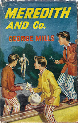
The illustrative imagery of his books, though, would need some updating, making it more a part of the modern world. 1957's Meredith and Co., published behind the Iron Curtain in Czechoslovakia by Andrew Dakers, Ltd., London, featured modernized haircuts and overall appearance of the students at fictional Leadham House School.
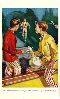
Not only does this edition fail to have a copyright date, it also fails to name the illustrator—or illustrators—completely. The dust jacket and frontispiece contain the exact same image: A full-colour, pthalo-hued setting featuring several primary-colour clad boys being caught out of their dorm rooms at night. It's a low budget composition by an artist signing his name only as "VERNON," very reminiscent in character of the sort of cheap, colour children's book illustrations I became familiar with as a boy in the 1960s.
The frontispiece is merely a cropped version of the poorly-registered four-color-separation illustration on the cover, replete with a disembodied hand holding a flashlight at right. Expense quite obviously was spared in putting together this third edition of the text.
It's perfectly non-descript, but that belies the better quality of the artwork inside. There are four nicley done black and white plates that modernise the artwork beyond what the Brocks and John Harris had done—these aren't crafted to resemble engravings—while still capturing the nostalgic charm of the story. It's easy to see why children would have been captivated by these illustrations. [Click any image to enlarge it in a new window.]

"Percy Oliphant Naylor Gathorne Ogilvie, complete with
a nurse, red hair, and freckles, stood with his mother on
the platform at Victoria Station." [Page 9]
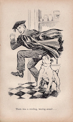
"There was a rending, tearing sound . . . " [Page 57]
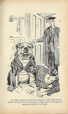
" . . . his right forepaw clumsily bandaged, and a first eleven
blazer buttoned round his neck, a large brown bulldog was
staring stolidly at nothing!" [Page 129]
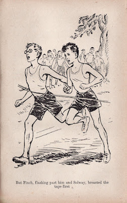
"But Finch, flashing past him and Solway, breasted the
tape first" [Page 219]
The four interior plates are unsigned, and may or may not be the work of 'Vernon.' They are as well considered and pleasant as the painting on the frontispiece is ho-hum, and could be his work.
As George Mills and his pre-WWII literary work entered a new age, it seemed as if the artwork min his books, while not quite what it had been at the peak of his popularity, was in relatively good hands.


![Meredith and Co. [1933] by George Mills](https://blogger.googleusercontent.com/img/b/R29vZ2xl/AVvXsEjlUeRNPnH8Xd8JT59QdtabQHRI6DI6Hqew57i6qixjOL3LjgUD9g22o3-wNlmBya36D5-6KZXX-sxLnktAfEqjlvTmdwyiIL2K6VHOGW2Wq9Pe8_oFGknENfVE1Xrkdj0b8FYXTz_6SMg/s1600-r/sm_meredith_1933.JPG)
![King Willow [1938] by George Mills](https://blogger.googleusercontent.com/img/b/R29vZ2xl/AVvXsEgiz_iaQjinIbVw6yQ-W4hwx6wGJwMQH9azCs3Qacp9eX627B7Eq9hMn1wlHLzlkbcflHRWM8VcPX-1uteKbs4LA5q5Oq69WhrnhzBQLjpseK_M34PSoOOhTZ96EfVAGFehG53gZ0M4EvU/s1600-r/sm_1938.JPG)
![Minor and Major [1939] by George Mills](https://blogger.googleusercontent.com/img/b/R29vZ2xl/AVvXsEgH5nj4Q6BNpzVEb1vyJeGV6ikuN4SFAyDa-jypIgbvdrxqcjHkNxqjrXH7ptZmge7oTTpn5QjAI0yCJPdI-fIzooCDD1TAA3RDxO9jzLcU3QOIhBWKiKNz6CPjCSTZgIPd9_4zM7LLpAw/s1600-r/sm_1939.JPG)
![Meredith and Co. [1950] by George Mills](https://blogger.googleusercontent.com/img/b/R29vZ2xl/AVvXsEgm_JPAXPpX0wb8bDkjYG67Sg1HePiPhRP6b9oUMWvkJhiW6XJzmxTQ7TBepfxpPgRrFNCRuumYRj-SAfU9Kw-uDsbO5HBtyxfQfClHVMJxJUkDpbkrCPhzpC4H_g_ctlirgnSla4vX1EQ/s1600-r/sm_1950.JPG)
![Meredith and Co. [1957?] by George Mills](https://blogger.googleusercontent.com/img/b/R29vZ2xl/AVvXsEg0zRm3-CCmA8r2RrBmrACDvmxJjoBjfxUoPI9yc6NWu1BZ3dd89ZvCixmmKZe1ma0QiDIrsDZNqf-8h1egh0JLiRYHagXAqQ1UknWPy6SksK76psYPcEMLGa_Aj7wo2vMFPo0aMdcx_pg/s1600-r/sm_meredith.JPG)


No comments:
Post a Comment